.png)
Overview & Scope
Year
Client
Services
Role
Tools
The Problem
Despite the rise of food trucks and pop-ups, most mobile food discovery platforms focus on traditional restaurants. There is no cohesive app that allows users to locate, evaluate, and order from these transient and trending food venues efficiently.
The Goal
Create a streamlined mobile experience to help users discover food trucks, pop-ups, and ghost kitchens based on location and preference, complete with ordering, accessibility filtering, and real-time updates.
User Research
I conducted a series of qualitative interviews and online surveys with 5 users. Insights revealed a clear demand for a convenient way to explore mobile and pop-up food vendors.
Users emphasized convenience, the desire to try new cuisines, and the importance of accessibility and real-time updates.
Many users expressed that while they love food trucks, they don't know where to find them unless they stumble across one.
Pain Points
- Convenience: No centralized platform for reviews, maps, and menus
- Distance: Users want to limit their travel radius (max 20 miles)
- Accessibility: Lack of visibility into ADA-friendly vendors and accessible seating options
- Engagement: No ability to follow favorite vendors or get alerts for nearby activity
Competitive Analysis
The main goal for this audit is to explore and gain insights into how the competitors place themselves within the market and how well each app establishes itself in usability and finding the nearest food truck. By doing this, I’ll focus on the UI/UX design elements, analyze what works and what doesn’t for the user, and gauge how I might implement insightful ideas into the Feest App going forward.
Personas

Julian – Retail Store Manager
Goal: Discover unique lunch options during short breaks
Pain Point: Limited fast food selection and time constraints

Trang – Operations Manager
Goal: Find inclusive food truck experiences with accessible seating
Pain Point: No visibility into wheelchair-friendly options in other food apps
User Journey Maps

Julian's Journey: Julian opens the app during his lunch break, uses map view to locate a trending food truck within walking distance, views the menu, places a quick pickup order, and receives directions to the location.

Trang's Journey: Trang filters search results to show wheelchair-accessible pop-ups, finds one hosting an event nearby, views reservation availability, books a table, and receives confirmation with access info.
Starting the Design

Initial design work started with paper wireframes focused on quick access to vendor locations via geolocation. I prioritized simplicity and clear iconography. In digital wireframes, I introduced accessible design elements such as visual labels for wheelchair-friendly locations and distinct pin types for trucks, pop-ups, and ghost kitchens.

The low-fidelity prototype included 3 key user flows: truck tracking, accessible seating reservation, and mobile food ordering. Each flow was tested for navigation efficiency and intuitiveness.
Digital Wireframes


Usability Testing
I conducted 2 user studies and an affinity diagram and found some thematic patterns within the research. Finally, I gathered the research and found some insights that will help create a more user-centered experience.
Round 1 Findings (Low fidelity prototype)
- Users found the pickup process had too many steps
- Lack of clear visual hierarchy for navigation and directions
Round 2 Findings (High fidelity prototype)
- Desire for pre-order visibility of menu and prices
- Need for real-time truck status and availability
- Simpler accessibility features and reservations flow
Refining the Design
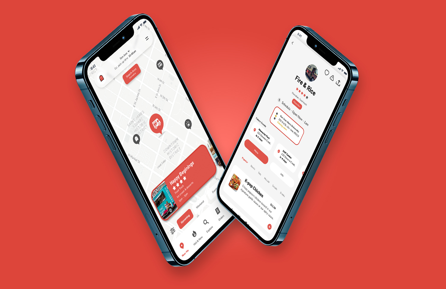
I addressed usability feedback by enhancing the map interface with stronger visual cues and a "Get Directions" button. I also restructured the vendor card layout to prioritize key actions like viewing menus, checking operating status, and ordering.
High Fidelity Mockups

After prioritizing some insights. I found that most users had trouble getting directions to a truck. I added a stroke to help focus the user on it’s current location, then added a “Get directions” button to get the user to the location of the truck.

Another priority insight indicated that users wanted to see menu information and truck status before ordering for pickup. To solve this, I added a status indicator as well as a “+” button in the menu item card in order to prioritize the ordering experience.

The high-fidelity prototype introduced a more visually appealing and refined user flow. After iterating to solve issues from the previous study, the pickup and reservation process was improved and felt seamless and less confusing.
Accessibility Considerations
- All icons use distinct shapes and colors for maximum clarity
- High contrast mode for critical areas like menus and navigation
- Dedicated filters and indicators for accessible dining options
Final UI

Key Takeaways
Impact: Feest offered a joyful and inclusive experience for users looking for spontaneous dining options. The app filled a gap in the market for real-time discovery of non-traditional food vendors.
What I Learned: Good design emerges from continuous iteration. Inclusivity must be intentional. The deeper the user insight, the stronger and more focused the solution becomes.
User Feedback: “Feest is a pretty nifty app. If you have a fleeting appetite and are a food truck junkie—it’s a much-needed and enjoyable app to have in my life!”
Next Steps
- Enhance real-time tracking and push notifications for vendors
- Expand accessibility features to support a broader range of needs
- Explore community-driven features (e.g., reviews, social food alerts)
.png)


