
Overview & Scope
Year
Client
Services
Role
Tools
The Problem
Despite the growing demand for healthy and diet-conscious options, platforms like GrubHub and Uber Eats don’t adequately serve users who need specific accommodations (gluten-free, vegan, paleo, allergy-sensitive). Their interfaces aren’t built with dietary filters or personalization in mind.
The Solution
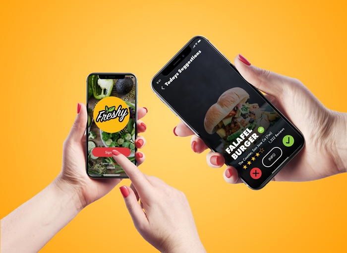
Freshy is a health-first food delivery app designed around personalization. Users input their dietary needs and preferences, and Freshy recommends compatible restaurants and meals. The experience is seamless, empowering people to live healthier without the friction of filtering through menus manually.
Goals
• Help users discover restaurants based on dietary preferences and restrictions
• Enable easy, on-demand ordering with customizations
• Build trust with real reviews and community-driven discovery
• Deliver a clean, modern mobile experience with Apple Watch support
Research
I conducted a competitive analysis to identify gaps in current food delivery services, developed user personas to understand the needs of health-conscious and allergy-sensitive individuals, utilized mood boards to establish a fresh brand identity, and employed word listing to define core brand attributes for a consistent user experience.
Research Methods
- Competitive analysis
- User personas
- Mood boarding
- Word listing
Competitive Analysis
We explored existing food platforms like:
• Yelp – Strong reviews but lacks customization
• Uber Eats – Quick delivery but not diet-friendly
• GrubHub – Great interface, but not health-focused
These services miss the mark on serving users with specific health needs. Freshy fills that gap by putting dietary preferences front and center


Target Audience
• Health-conscious adults
• Busy professionals who don’t have time to cook
• Individuals with dietary restrictions or food allergies
• Users aged 20–45 in urban areas
Personas
Freshy’s user personas represent busy professionals and health-conscious individuals seeking convenient, diet-specific meal options.

Marie Winters
Yoga Instructor
24 / Female / San Francisco, CA
“I’m always on the go. I want something healthy and fast—but it also needs to fit my vegan diet.”.
Bio:
Marie is a full-time yoga instructor who teaches classes out of her studio in San Francisco. She leads an active and healthy lifestyle.
Pain Points:
Marie rarely cooks, and her meal preps often go stale by the end of their cycle. She demands fresh, fast, and healthy food but finds it difficult to locate suitable options.
Interests:
- Brands: Lululemon, Nike, Apple, Anthropologie
- Activities: CrossFit, meditation, gardening

Emily Chang
Product Manager
30 / Female / Los Angeles, CA
“I’m gluten-intolerant and too busy to cook. Ordering food is hard when I can’t customize meals..”
Bio:
Emily works as a product manager for a small start-up in Los Angeles. She makes a conscious effort to be mindful of her eating habits, especially considering her gluten sensitivity.
Pain Points:
Emily often works 12-hour shifts, leaving her little time to cook. Ordering delivery can be challenging due to limited options that accommodate her food allergies.
Interests:
- Brands: Patagonia, Google, VW, Toms
- Activities: Movies, cycling, traveling, cooking, mobile gaming

Ren Dylan
Senior UX Designer
24 / Male / Oakland, CA
“Eating clean is important to me. I want a way to discover new food options that meet my diet without the hassle.”
Bio:
Ren grew up in Michigan and loves his work as well as pursuing creativity in his free time. He enjoys running and working out.
Pain Points:
Ren struggles to find good options that meet his dietary restrictions and often finds it challenging to have available options when he needs them.
Interests:
- Brands: Apple, Beats, Kia, Vans
- Activities: Gaming, cycling, traveling, cooking, art
🧭 UX Strategy
Freshy’s core features were crafted around user needs:
• 🔍 Smart Filters – Customize results by diet, allergy, cuisine, and more
• 📱 Social Feed – Discover what your friends are ordering
• 🍽 Meal Profiles – View detailed nutrition facts and ingredients
• 🧠 Suggested Meals – Based on previous orders and preferences
• ⌚ Apple Watch Sync – Track calories and gain reward points
🖼 Visual Identity
• Tone: Clean, fresh, and energizing
• Keywords: Healthy, quick, smart, modern
• Colors: Soft greens, whites, and neutrals to reinforce trust and freshness
• Typography: Crisp, easy-to-read sans-serif fonts
• Icons: Rounded and minimalist to support a welcoming interface
To start with the design, I created the information architecture to understand the app's structure. Afterward, I made some initial low-fidelity wireframes to get the basic idea and structure of the layout.
Once I had the structure of the layout, I designed a first draft of the concept and how it would look as a high-fidelity layout. From that point on, I did some new iterations, which was an improvement over the first draft.
Information Architecture

Organization Breakdown:
1. Entry Point:
- The user begins at Login/Signup and is then directed to the Home screen.
2. Main Navigation Options from Home:
- Search → Leads to Suggested restaurants/meals.
- Favorites → Directly connects to the ordering process.
- Profile → Includes a Goal + Reward feature.
- Social → Includes Friend Favs, possibly showing friend-recommended meals.
3. Order Flow:
- Once a user selects a meal (via Search, Favorites, or Social recommendations), they proceed to Order.
- The order is then Reviewed before moving to Checkout.
Key Features of This IA:
- Multiple entry points to ordering: Users can initiate orders from Search, Favorites, Social, or Profile (Goals & Rewards).
- Incorporation of social elements: The Friend Favs feature under Social allows users to see recommendations.
- Gamification potential: Goal + Reward under Profile suggests a reward-based system, encouraging engagement.
- Linear Checkout Flow: Once an order is placed, the process is
streamlined (Order → Review → Checkout).
Low-fidelity Wireframes
I created simple low-fidelity wireframes to help conceptualize and structure the layout using the information architecture as a reference to how the app might work in different user flows. This flow shows the onboarding, order process, and payment confirmation.


The Freshy App Low-Fidelity Wireframes outline the core user flow for ordering customized, diet-friendly meals. These grayscale mockups focus on layout, functionality, and user interactions rather than final visual design.
Wireframe Breakdown:
1. Onboarding & Personalization
- Welcome Screen: Users can log in, sign up with Facebook, or explore as a guest.
- User Profile Setup: Collects details like age, weight, and location for personalized recommendations.
- Dietary Preferences & Allergies: Users select special diets (e.g., vegan, gluten-free) and specify food allergies.
- Cuisine Preferences: Users pick favorite cuisines (e.g., Italian, Korean) to refine meal suggestions.
2. Meal Discovery & Customization
- Suggested Dishes: Based on preferences, Freshy recommends meals with pricing and ratings.
- Meal Details & Customization: Users view detailed dish descriptions, modify ingredients, and add suggested drinks or sides.
3. Ordering Process
- Order Summary: Users review their selected dish, including add-ons and total cost.
- Address Confirmation: Ensures correct delivery location (business or residential).
- Payment Confirmation: Users review the final price, tip, and delivery fee, then complete the order using payment options like Apple Pay.
4. Order Completion
- Order Confirmation: Displays a summary of the order with a “Save to Favorites” option for quick future orders.
Key Takeaways
- User-Centric Approach: Personalization is at the core of Freshy’s experience.
- Seamless Navigation: The flow is structured to make ordering quick and intuitive.
- Customization & Flexibility: Users can refine their meals to fit their dietary needs.
High-Fidelity Screens
After iterations of refining the low-fidelity wireframes, I moved onto the high fidelity screens. This is the part of the process where I design for layout, typography, and color scheme to make the app feel like a real world product.
Visual Design

1. Search & Map View
- Search Bar & Map: Users can quickly locate nearby restaurants or dishes using the search field.
- Restaurant Card: Displays essential details (name, rating, reviews), providing an at-a-glance overview of options.
- Visual Cues: A clean layout with brand-aligned colors, icons, and map pins to guide the user.
2. User Profile & Rewards
- Profile Information: Shows user photo, location, and a short status or tagline.
- Diet Preferences & Rewards: Highlights dietary choices (e.g., vegan, gluten-free) and tracks reward points for user engagement.
- Navigation: A bottom tab bar for easy access to other app sections (e.g., Home, Picks, Social).
3. Today’s Picks (Swipe/Recommendation)
- Featured Meal: Large, eye-catching imagery (e.g., Falafel Burger) with rating and review count.
- Quick Decisions: “Yes” or “No” buttons (or swipe gestures) let users filter through recommended dishes rapidly.
- Personalized Suggestions: Reflects user’s dietary needs and preferences.

4. Picks for You & Local Favorites
- Recommended Meals: Curated list of dishes tailored to the user’s profile and location.
- Local Favorites: Shows popular nearby options with visuals, ratings, and short descriptions.
- Search Integration: Top bar search remains consistent, enabling quick changes to filters or keywords.
5. Dish Details
- Meal Overview: High-resolution image, name, rating, and brief description (e.g., “Green Goddess”).
- Key Info: Nutritional highlights, ingredients, and user reviews.
- Action Buttons: Options to customize or add the meal to an order, emphasizing a smooth ordering experience.
6. Social / Friends View
- Map & Friend List: Displays friends’ favorite spots or current orders.
- Social Proof: Encourages users to try meals that friends recommend.
- Seamless Integration: Maintains consistent bottom navigation, allowing users to toggle easily between social features, profile, and main ordering flows.
High Fidelity Screens for smartwatch
I wanted to enhance the user experience with its reward system. With the collection of points and goals, I created the smartwatch app concept to bring all of that into a more engaging experience for users with smartwatches. I wanted a simple and straightforward look, and wanted to make the information front and center when ordering and understanding the method of pickup and delivery.

🧠 Key Learnings
One of the biggest challenges I faced in this project was finding the right balance between user needs and Freshy’s core objectives. I needed to design an experience that was intuitive, engaging, and accessible while ensuring that the app’s functionality remained seamless. Stripping down unnecessary complexities while enhancing usability and personalization was key to delivering a strong user experience.
Key Takeaways
Since this was a school project, the design process differed from industry workflows, giving me insight into how methodologies shift based on project constraints. I realized that UI/UX design is not a one-size-fits-all process—different research methods, iteration cycles, and strategic decisions lead to unique outcomes. This experience reinforced the importance of flexibility, user testing, and iterative improvements in crafting a well-rounded product.
Next Steps
Moving forward, I plan to apply the UI/UX methodologies I’ve learned to future projects, refining my approach with user-centered design thinking. Additionally, I want to iterate on past projects, integrating new research methods and design principles to enhance functionality and usability. By continuously improving my process, I aim to create more impactful, user-friendly experiences in my future work.
Other considerations:
• Personalization adds value: People are more likely to order when they feel seen.
• Health and convenience can co-exist: Users want fast food—without compromising their diet.
• Good UX = trust: A clean, helpful UI builds confidence in making safe food choices.
✅ Results
Freshy sets a new standard for diet-aware food delivery apps. It empowers users to make healthier decisions, discover new food experiences, and connect with a like-minded community—all within an intuitive mobile experience.
.png)


.png)


